


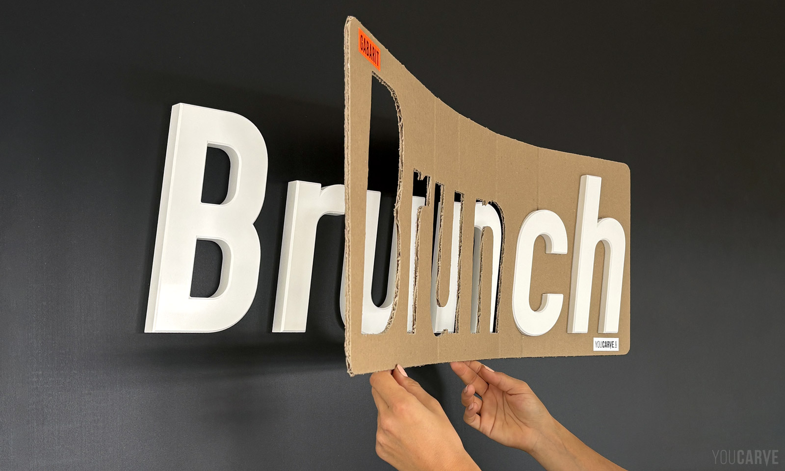
We talk a lot about materials, thicknesses, and finishes, but much less about the step that will really determine the look of a sign: the installation. Yet this is where the final result is decided, and that is exactly what the template helps to secure. A poorly installed sign is very difficult to fix. A slightly crooked wall logo, and no one will be able to tell why the storefront "looks less professional" than the one next door.
This is the unique feature of cut-out letter signage: the manufacturing can be flawless, but the final result essentially depends on what happens when fixing the pieces to the support. This is why the template is not a simple accessory slipped into the package; it is a key piece of the project, designed with as much care as the letters themselves. It is also, as we will see, what allows you to install your sign yourself with complete peace of mind.
In brief
- A mounting template is a cardboard support, at a 1:1 scale, which transfers the exact position of each letter or its mountings onto the wall.
- There are two types: the positioning template (or insertion template) for glued letters, and the drilling template (or marking template) for letters on snap-on spacers.
- The template eliminates the three classic installation errors: letter spacing, alignment, and orientation.
- It makes installation quick and easy: no more measuring or tracing letter by letter, you place the pieces directly in the right spots.
- The template allows customers to install their sign themselves, without an installer, and therefore without travel or installation costs.
What is a mounting template?
A mounting template is a physical support that reproduces the exact layout of your letters or logo elements at a 1:1 scale. It is positioned on the wall before installation, and it transfers the entire geometry of the project onto the support: the location of each piece, its alignment, its spacing, and, depending on the case, the drilling points.
There are two types, corresponding to two mounting methods:
- the positioning template (or insertion template): the outlines of the letters are cut out, and the pieces are inserted directly into the openings,
- the drilling template (formerly called marking template): the mounting positions are indicated by small holes through which marks are transferred onto the wall.
Note: some customers speak of a "pattern" or "jig". The terminology is not standardized in the trade and we understand each other very well. The real difference is not in the name, but in the object: a sheet of printed paper and a rigid digitally cut template do not provide the exact same service on the day of the job.
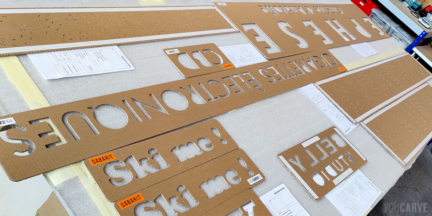
Preparation of positioning and drilling templates: special care is applied during their production in the workshop...
Why installing letters without a template is trickier than it seems?
A tape measure, a level, and a pencil are useful, but not enough. Until you have done it yourself, you generally underestimate how complicated the exercise is, for four reasons:
1 - Alignment is not always based on the bottom of the letters
Alignment is the first trap, and undoubtedly the most counterintuitive: if you geometrically align the bottom of all letters on the same horizontal line, the text will appear uneven. For it to look perfectly straight, letters with rounded shapes (O, C, S…) must extend slightly below the baseline, just as they may extend slightly above the cap height at the top.
This overshoot is completely intentional: without it, an "O" would visually appear taller (and smaller) than an "H", even though they have the same theoretical height. It is an optical correction related to the overall shape of the letters: round shapes, but also pointed shapes like "A" or "V", must slightly exceed their geometric limits to be perceived as "aligned" with straight shapes. These adjustments are therefore essential to achieve the impression of an even alignment to the eye.
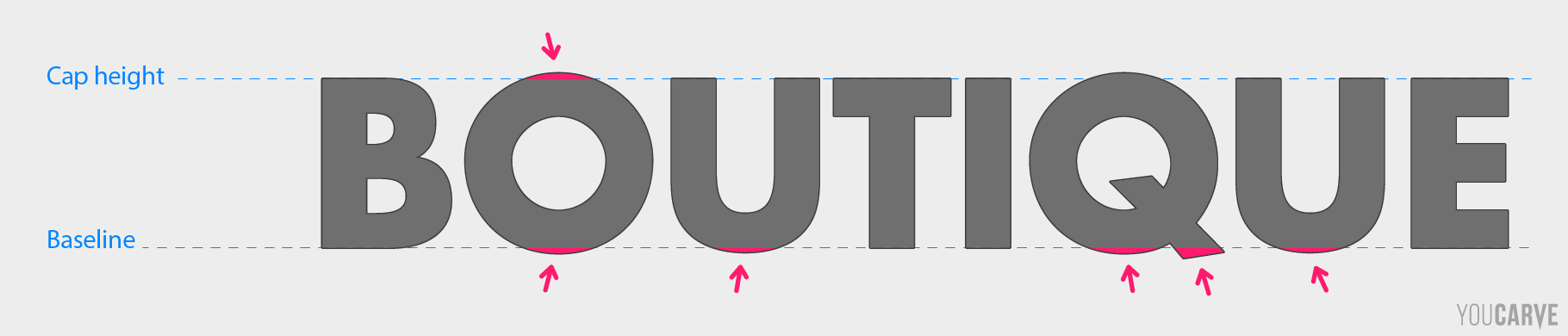
Round capital letters extend beyond the baseline and cap height.
2 - Spacing between letters is "no small task"
The same trap occurs with the spacing between letters, this time horizontally. What typographers call kerning is the adjustment of space between two letters based on their shape: what the eye perceives as even spacing has nothing to do with mathematical spacing. What matters is not the physical distance separating two letters, but the "volume" of space they leave between them. If you stick to an identical gap between the edges of each letter, you get a geometrically regular result, but visually unbalanced. This is typically the defect that no one can name, but everyone notices.
For example, an "A" followed by a "V" forms something like a funnel that widely opens the space, whereas an "H" followed by an "I" creates a narrow vertical space between two parallel edges. At an equal distance, the first pair will seem significantly more spaced out than the second. To regain a sense of homogeneous space, you must therefore tighten the A and V, and widen the H and I.
This work has already been carried out by the typographer when creating the font, for all letter pairs. The settings are directly integrated into the font file. This is why, on a screen, software handles it automatically. On a wall, the person in charge of installation must reproduce these offsets, letter by letter.
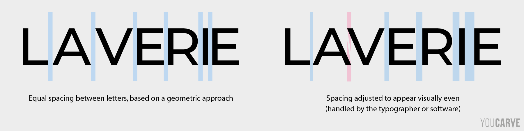
The same sign lettering with, on the left, constant mechanical spacing, and on the right, more aesthetically pleasing optical spacing.
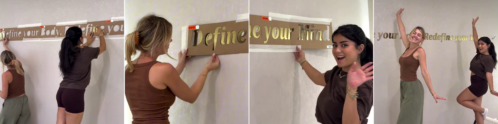
An entire phrase, in italics and with serifs, installed by two people using numbered templates positioned edge-to-edge.
The spacing and alignment of each letter are provided by the template. (© Define Studio)
3 - Letter orientation: the mistake no one thinks about
A letter mounted upside down is rarer than the previous two errors, but when it happens, it is dramatic.
Many amateur installers (and sometimes even construction professionals) lack typographic culture, which is completely understandable. The problem is that certain letters seem perfectly symmetrical without actually being so. An upside-down "N", "S", "H", or "Z" remains perfectly legible, yet something looks wrong. You perceive it immediately, without always being able to put your finger on it.
What most often reveals the inversion are the serifs: those small extensions or strokes located at the ends of letters in serif fonts. On a Roman capital "N", for instance, they are not arranged in a perfectly symmetrical way. Rotate the letter by 180°: its overall outline remains almost unchanged, but the serifs end up in a position that is no longer what the typographer intended. The letter remains legible, but it "rings false" to the eye.
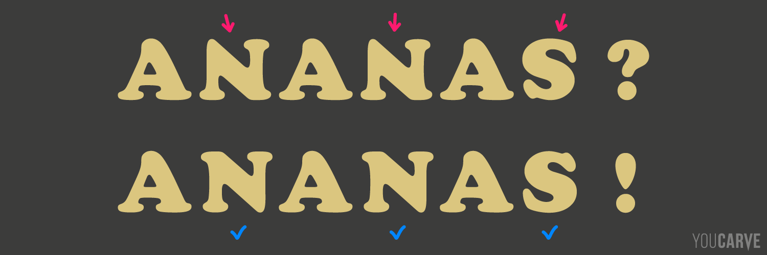
At the top, the two Ns and the S are upside down. The word remains perfectly legible, yet something looks off. At the bottom, the same composition right side up.
An example circulated on the web in September 2026, when the magazine Le Réveil reported the case of the gendarmerie in Neufchâtel-en-Bray, Seine-Maritime: the three "N"s in the inscription "Gendarmerie Nationale" had been installed upside down. The site was accepted by the administration without anyone noticing anything, and it was ultimately a reader, from Paris, who spotted the anomaly on a photo published by the newspaper. (Source: actu.fr / Le Réveil, September 12, 2026)
Between design and installation, there must therefore be a reliable way to transmit the positioning information defined in the workshop to the wall. This is precisely the role of the template. With an insertion template, the question does not even arise: the letter simply will not fit into the opening if it is facing the wrong way. On our drilling templates, we also position the mountings asymmetrically whenever the shape allows it, creating a foolproof mechanism: the letter can only be snapped into place the right way.
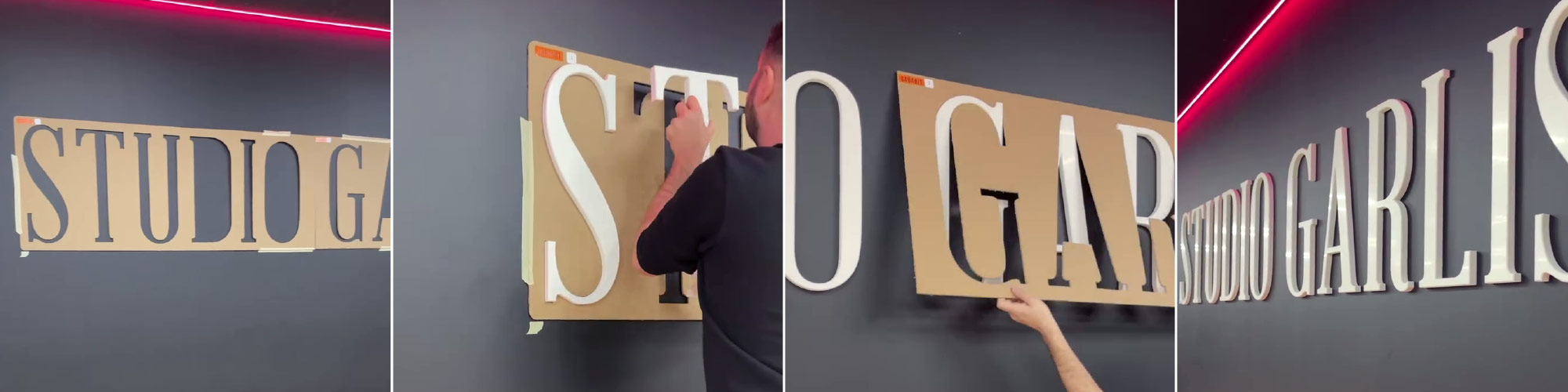
Capitals with very pronounced serifs: each letter fits into its opening only when correctly oriented. (© Studio Garlisi)
4 - Without a template, previewing is difficult
Final difficulty: without a template, it is hard to visualize the project in place before committing to fixing the pieces. You calculate, measure, trace, step back to evaluate... but you can only truly appreciate the rendering once the letters are installed.
With a template, it is much simpler: you press it against the wall, step back, and can immediately assess the height, centering, and relationship with the door, reception desk, or furniture. You shift it ten centimeters if needed, raise it, or lower it.
The aesthetic decision is thus made before installation, at a time when everything is still modifiable. Once the letters are fixed, it is too late to easily correct a bad overall positioning.
Two types of templates, and what they are used for
The type of template will depend on the chosen mounting method.
| Positioning template | Drilling template | |
|---|---|---|
| Other names | Insertion template | Marking template |
| Associated mounting | Double-sided tape, gluing, direct screwing | Snap-on spacers |
| Principle | Outlines are cut out; letters are inserted inside | Mounting points are indicated; marks are transferred |
| What it guarantees | Spacing and alignment of pieces relative to each other | The exact position of each mounting socket on the wall |
| Reusable | Yes, if kept flat | Yes, if marks are transferred rather than drilling through it |
Note: the drilling template is inseparable from the snap-on spacers option. The two go together in the configurator; it is not possible to order one without the other. This is not a commercial constraint, but a technical necessity: the studs are fixed to the back of the letters at positions we have calculated, and only a template from the same manufacturing file allows them to be found on the wall.
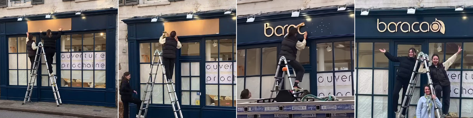
Facade installation of a sign on snap-on spacers using a drilling template, a few days before the shop opening. We present the template, mark, drill, then clip the letters onto their sockets. (© Baracao)
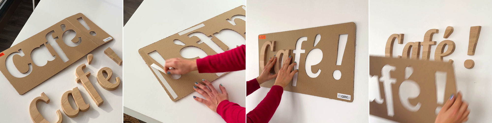
Installation of a wooden wall logo for a break room: using the positioning template (insertion) and double-sided tape, installation is easily done in a few minutes (see our full article on the design and installation of this project).
What makes a good mounting template
A template looks like a simple piece of cut cardboard, which would suggest that they are all equal. In reality, everything comes down to details that are not obvious at first glance, but are felt from the very first letter inserted.
Clearance: neither too much nor too little
Insertion clearance—that is, the gap between the piece and the opening that receives it—is the most technical point of the subject.
A letter cut by milling does not have the exact contour of its vector drawing. In inside corners, the router bit leaves a radius corresponding to its radius: the inner point of a "V" is never perfectly sharp, and the internal corners of an "E" are slightly rounded.
If the insertion template is cut according to the theoretical file, the pieces will rub and catch in the corners, making insertion difficult. If it is cut with too generous a safety margin, the letters float in their opening, and you lose all the desired precision.
We have developed a manufacturing process that applies the actual geometry of the machined parts to the template openings, tool radius included, with a calibrated functional clearance. The letters fit smoothly, without forcing and without perceptible play.
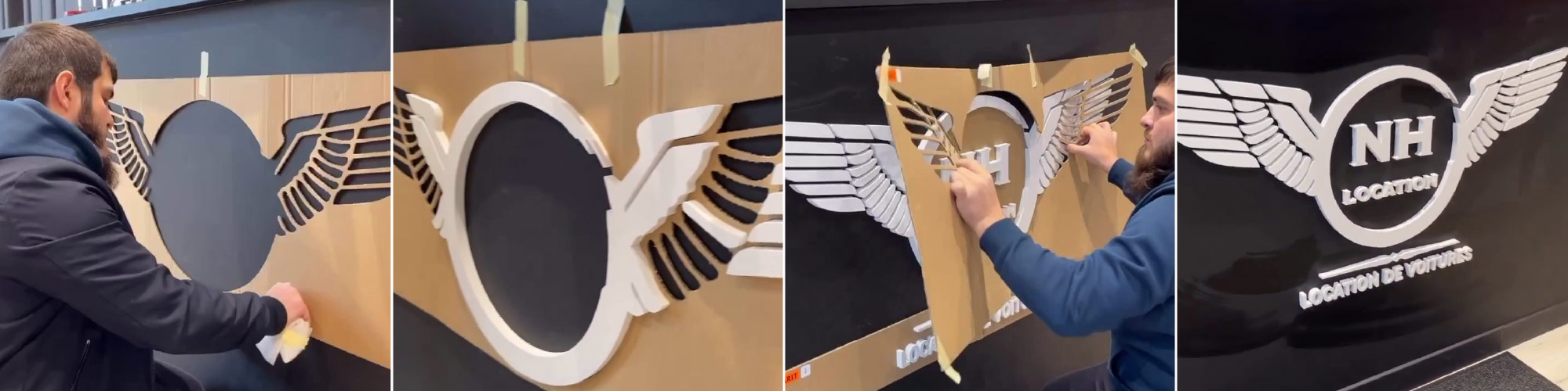
Fine and detailed cut shapes: pieces fit without forcing or floating because the template openings account for the router bit radius. (© NH Location)
Calculated mounting positions
For drilling templates, the question is not only where to drill, but also how many times.
The number and distribution of spacers are determined by us on a computer, taking into account the shape of the letter, its size, the material (and therefore its weight), as well as the technical recommendations of the fastener manufacturer. A letter with too few mounts will lack stability or present a risk of falling off. An unnecessarily over-fixed letter means extra holes in the wall and wasted time on site. The balance is handled on a case-by-case basis and relies on long experience in fixing wall letters.
Finally, and as explained above, we make sure to position the mountings asymmetrically whenever the shape allows it, in order to create a foolproof effect and ensure that the letter snaps into place only the right way.
These positions are then transferred without intermediaries: the same digital file is used to mark the stud locations on the back of the pieces and to machine the template. This explains why the sockets screwed to the wall according to the template align perfectly with the studs.
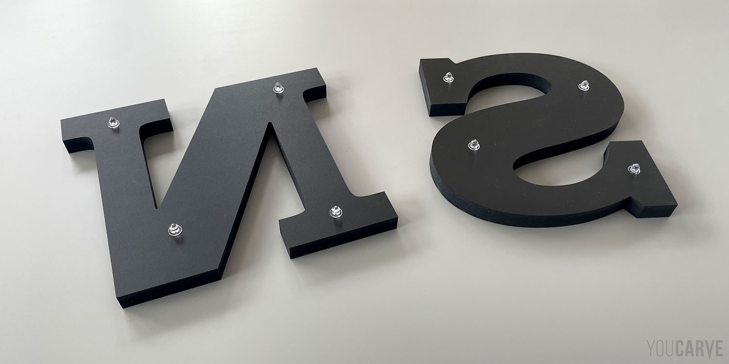
Back of two seemingly symmetrical letters, but with their mountings positioned asymmetrically to ensure a foolproof effect.
Cardboard, quite simply
Several materials coexist in the signage market, each with its qualities and limitations:
The printed paper pattern: this is the most common and easiest solution to produce. Lightweight and compact, it serves its purpose for small formats and indoors. On a job site, however, it quickly shows its limits: it creaks in the package, tears when pulled, and blows away at the slightest open door. With a bit of wind outdoors, installation becomes a struggle...
Thin expanded PVC (2 to 3 mm): rigid and durable, it holds well in place and withstands handling. On the flip side, it is non-recyclable, which is hard to defend today, and remains brittle on small sections.
The original material of the parts: the template is then cut from the same sheet as the letters. The waste of material and the cost it represents make this practice rare, not to mention the lack of precision due to significant play during CNC milling manufacturing...
Cardboard: lightweight, rigid, recyclable, and economical, it is in our view the best compromise. Everything depends on manufacturing, to properly adjust the clearance with the parts and compensate for the milling radius (where applicable).
We have therefore selected single-wall brown corrugated cardboard for the following 5 reasons:
- rigid enough to stay flat against a wall once taped
- lightweight, allowing it to be handled alone, even over long lengths
- controlled foldability along the flute direction for shipping and storage
- reusable: kept flat and dry, a cardboard template remains usable and can be reused as-is
- recyclable: when disposed of, cardboard is 100% recyclable, via recycling bins or waste collection centers.
For long lengths, the template is delivered in several numbered parts, which align edge-to-edge on the wall in the indicated order. A four-meter sign thus fits into a standard package and is handled section by section.
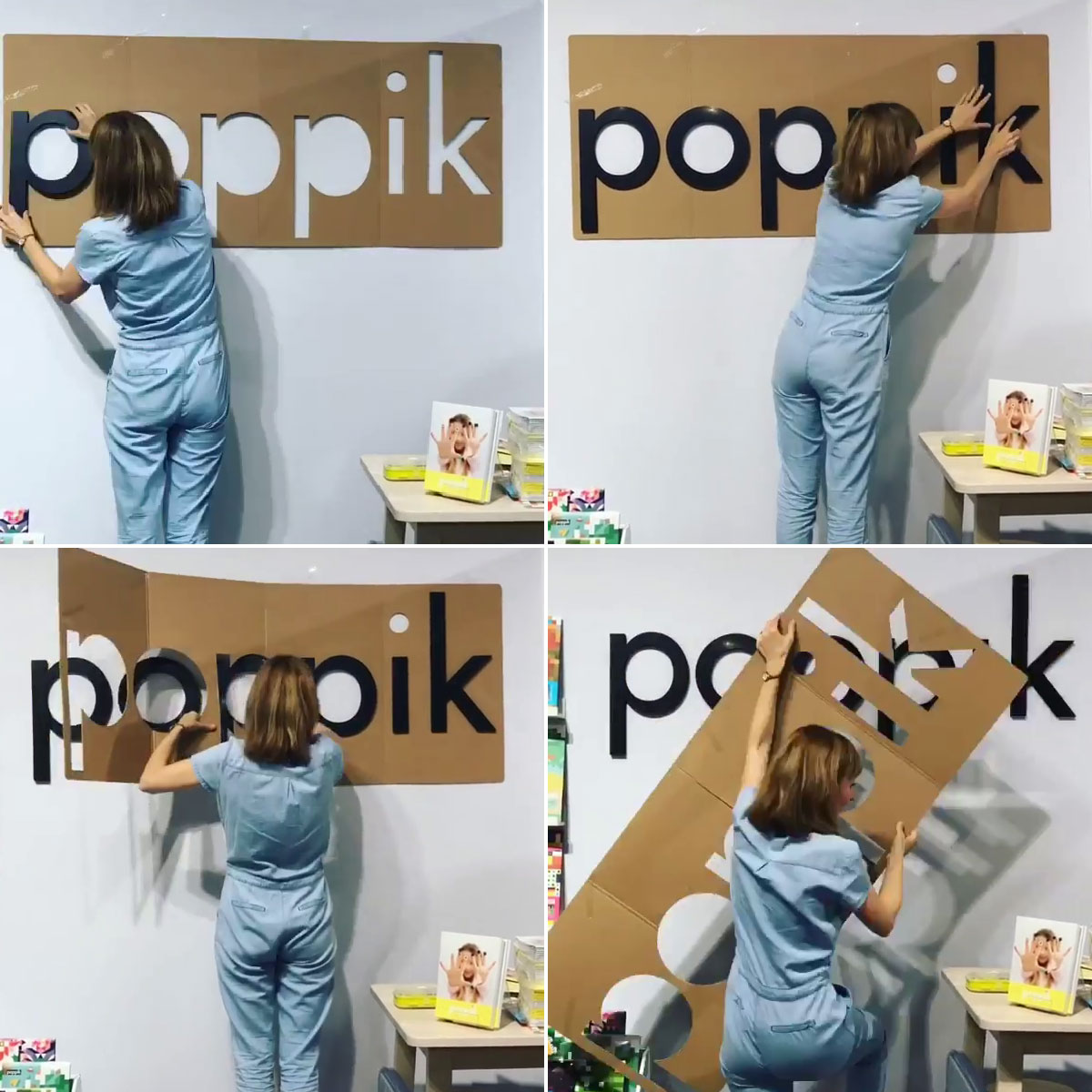
A cardboard template folds along its flutes and is removed easily without help. (© Poppik)
Reusability is worth pausing on. A template kept flat remains usable years later: moving, facade renovation, second installation in the same format, and the installation is repeated identically without taking a single measurement again. This is why we advise, for drilling templates, transferring the marks with a pencil rather than drilling directly through the cardboard.
Finally, there is a last advantage that is often overlooked: cardboard can be re-cut. If at the last moment you need to adjust spacing between two words or slightly move an element, a simple utility knife is all it takes!
Intentionally low-tack adhesive
Our templates are pre-taped and repositionable. Their adhesion is intentionally moderate: it must be enough to hold the template during installation while minimizing the risk of damaging delicate paint, peeling wallpaper, or ruining decorative plaster.
However, this adhesion reaches its limits on low-grip or heavily textured surfaces (stucco, concrete, structured plaster, very smooth paint...) and more generally outdoors. In these situations, two simple solutions help maintain the template: temporarily reinforce it with masking tape when the support allows, or get assistance to hold it in place while marking the mounting points or inserting the first letters.
Installing your sign yourself
Up until now, we have discussed technical aspects, but if we invest so much energy into designing our templates, it is for a reason that relates to who we are.
From day one, Youcarve's mission has rested on one ambition: democratizing custom cutting, making cut-out letters, pictograms, and 3D logos technically and financially accessible by giving our customers maximum autonomy. Not by skimping on materials or manufacturing standards, but by eliminating intermediaries and friction that inflate the bill without adding value to the product.
Concretely, this autonomy takes place in two stages:
First stage: design and ordering
Our configurators for letters and shapes allow you to design your project, visualize it, and get real-time pricing. You can order whenever you want, without waiting days for a quote, without calling anyone, and without a sales appointment. We obviously remain available by phone or email to advise you, but you decide if you need it.
What you save at this step: design fees, sales processing, and graphic design costs.
Second stage: installation
This is where templates come in, as the same reasoning applies to the next step of the project: you install your letters yourself, quickly and easily, with perfectly aligned and spaced finishing.
What you save at this step: travel and labor costs for installation, which often represent a significant portion of a sign's budget.
Put together, this offers a clear alternative to the traditional model where design, manufacturing, and installation are entrusted to a single vendor. You keep control over both ends of the chain, while we handle the middle—the part requiring machinery and workshop expertise. The result is less expensive, just as high quality, and above all, it's yours!
One point on which we never compromise: savings are never made on materials or manufacturing standards. Our materials and finishes remain high-end. What you save are structural costs, not quality.
Doing it yourself and enjoying it
Finally, there is something that has become one of the most rewarding aspects of our work: our customers' pride on installation day.
Even though they didn't machine the parts themselves, they are the ones who designed and configured their lettering, and then installed it.
Thus, many of our clients turn the installation of their sign or wall logo into a small event: filming themselves installing the letters, sharing the video on social media, with views and comments following. The simplicity of installation also allows the business to start generating buzz, sometimes even before opening (and when you tag us along the way, it's even nicer).
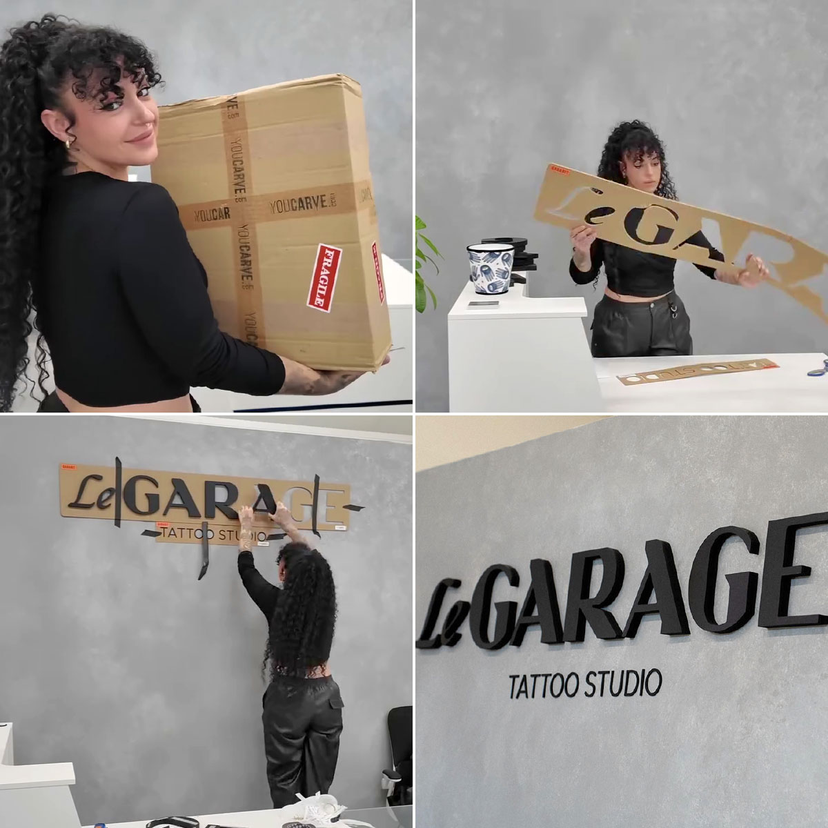
From the package to the wall, by a single person (© Le Garage Tattoo Studio)
Besides, one thing we love to remind: all the projects showcased on our social media were installed by our customers themselves. Not by a team of installers, not under studio conditions. By shopkeepers, artisans, and store managers, using a template, a spirit level, and a bit of method.
Mounting template: how much does it cost, and above all, what does it bring...
The template is generated directly from the letter manufacturing file, which keeps its design cost low. Its price remains moderate compared to what it provides: around 10 to 15% of the lettering or logo price. Above all, its value is not limited to its price: it is measured in saved time, ease of installation, and final result quality.
Time: an installation that would usually require several hours of measuring, tracing, and checking can be significantly shortened. For a reseller or installer billing their time, the benefit is immediate.
Installation cost: the template enables you to perform an installation yourself that would otherwise require a professional. Its price can thus be quickly offset.
Rendering: this benefit is harder to measure, but perhaps the most important. The template transforms an operation that usually requires precision and experience into a much simpler task.
What it changes according to your profile
You are a shopkeeper installing your own sign: the template is what enables you to achieve a professional result without hiring an installer. It is often the difference between successful savings and a regretful compromise...
You are a reseller, sign maker, ad agency, or independent installer: you can delegate installation without concern, even to a team discovering the product for the first time, and cut your site time in half. You also eliminate the risk of rework, which sometimes costs more than the installation itself.
You are responsible for store decoration or signage: you get a result compliant with brand guidelines on the first try, and you keep the template for the next location. For a network deploying identical signage across multiple sites, it is one of the few ways to get a strictly identical result from one establishment to another, regardless of the installer.
A final indicator that speaks louder than all our arguments: we are sometimes contacted by people who had their letters cut elsewhere and want us to manufacture only the template. It's not a service we offer, but the request is revealing...
Anticipating installation right from the order
In the end, the success of a sign or wall logo is determined long before installation day. It is prepared during the project design phase: choice of mounting method, taking the support into account, and, when relevant, creating a suitable template. When the day comes, all that's left is to level the template, insert or clip the letters, and step back. All the precision has already been integrated into the preparation.
Frequently asked questions about mounting templates
Can you really install your sign yourself?
Yes, with a template, a spirit level, and basic tools (pencil, and a drill for spacers), a single person can install standard lettering without special difficulty. The only real precaution concerns safety when working at heights.
How long does it take to install a sign with a template?
It depends on the project size, number of pieces, and working height. It can range from a few minutes for a wall logo with double-sided tape to a few hours for sign lettering on spacers. One of our customers installed a 10.50 m long Dibond lettering in just three hours, scaffolding included.
How do you center and level a mounting template?
First, locate the vertical axis of the target area (center of a wall, window, facade panel), then the desired height. Place the template matching its center with this axis, check horizontal alignment with a spirit level placed on its edge, and adjust before pressing it against the wall. This single leveling step suffices for all the lettering.
How to align letters on a wall without a template?
It is possible, but much trickier. You must draw a level line, transfer spacing for each letter from a 1:1 scale drawing or original file measurements, account for the overshoot of round letters, and verify the orientation of each serif letter. It is precisely this tedious and error-prone work that the template handles for you.
Is the template included with every order?
It depends on the type of template.
The positioning template is an option to check in the configurator. It is recommended in the vast majority of cases, but in rare instances it might not be necessary (e.g., for a single piece placed directly on the wall, or for a intentionally random or whimsical composition). That is why it remains optional. So remember to check it whenever your project involves multiple pieces to align.
The drilling template is not optional: it systematically accompanies snap-on spacer mountings and is included in the package whenever you select this mounting method.
What is the difference between a positioning template and a drilling template?
The positioning template (or insertion template) is used to place the parts themselves: outlines are cut out and letters are inserted into them before fixing with double-sided tape, glue, or screws. The drilling template (or marking template) is used to position the mounts: it indicates where to drill the wall to screw in the spacer sockets, with letters clipped in afterwards.
Can I order a template alone, without letters?
No, we do not sell templates separately. However, we occasionally remake a template for a customer who misplaced or discarded theirs and wishes to reinstall their lettering elsewhere. In that specific case, simply write to us, and we will provide a custom quote.
Is the template reusable?
Yes, provided it is stored flat and protected from moisture. On a drilling template, it is better to transfer marks with a pencil rather than drilling through the cardboard, precisely to preserve this reusability.
Is a template useful for a single-piece logo?
Yes, but for other reasons. Spacing is obviously not an issue on a single-piece item. However, it still aids in previewing overall placement: centering, height, and, for spacer mounting, exact transfer of drilling points.